Watkins: design and modernity

Margaret Watkins (1884-1969) ~ Still Life – Bathtub, New York, 1919 | src The Revolutionary Gaze at The Guardian
Margaret Watkins (1884-1969) ~ ‘Phenix Cheese’, 1924 | src El País Cultura
Margaret Watkins (1884-1969) ~ Lamp and Mirror, 1924 | src El País Cultura

Watkins was likely influenced by Arthur Wesley Dow, a Columbia University professor of fine arts who was closely associated with the White school. Dow wrote about the beauty of compositions that use curved and straight lines, and alternating light and dark masses. Dow also promoted the ideas of Ernest F. Fenollosa, who believed that music was the key to the other fine arts since its essence was “pure beauty.” Watkins herself used music as a metaphor for visual patterning in an essay about the emergence of advertising photography out of painting: “Weird and surprising things were put upon canvas; stark mechanical objects revealed an unguessed dignity; commonplace articles showed curves and angles which could be repeated with the varying pattern of a fugue.” / Quoted from: Margaret Watkins: Of Sight and Sound (National Gallery of Canada)

Margaret Watkins (1884-1969) ~ Design – Curves, 1919 | src The Nelson-Atkins Museum of Art

Margaret Watkins was a student at The Clarence H. White School of Photography in New York City.  The school emphasized the principles of design that were common to all modes of artistic expression.  This aesthetic, as seen here, resulted in works that merge realism and abstraction. Watkins received particular praise for her artistic transformation of the most common things: in this instance, the contents of her kitchen sink. / Quoted from The Nelson-Atkins Museum (x)

Margaret Watkins (1884-1969) ~ Design – Angles, 1919 | src MutualArt
Margaret Watkins (1884-1969) ~ Domestic Symphony, (1919), palladium print | src Of Sight and Sound at NGC

In 1919 Watkins made her first ground-breaking domestic still lifes, taking as her subject such mundane scenes as a kitchen sink and bathroom fixture. In Domestic Symphony, the graceful curve of the porcelain recalls the fern-like scroll of a violin. Again, the composition is striking: the lower three-quarters of the image is in darkness, anchoring the forms and volumes in the upper portion. / Quoted from: Margaret Watkins: Of Sight and Sound (National Gallery of Canada)

Jan Toorop · Salad Oil style

Jan Toorop ~ Poster for Delft Salad Oil, 1894 (RP-P-1912-2395) | src Rijksmuseum

Affiche Delftsche Slaolie (1894)
This poster was commissioned by the Nederlandsche Oliefabriek, an oil manufacturer in Delft. Two women with wavy hair and billowing draperies occupy most of the composition. One of them is dressing a salad.

The inscription on top Delftsche Slaolie makes it clear that the advert concerns salad oil, as do the bottles of salad oil on either side of the text. Below it is the crowned coat of arms of the factory (N O F), with a decorative area with peanuts on the left. The majority of the poster is taken up by the two graceful female figures with long hair and billowing draperies. One sits and is dressing a lettuce salad in a large container; the other has her gaze and hands raised. The women with their emphatic contours draw attention away from the actual advertisement, namely for the salad oil. The wavy, rhythmic interplay of lines with which the women’s hair fills the picture surface made such an impression that it became an icon and lent Dutch Art Nouveau its nickname, slaoliestijl, the ‘salad oil style’. | text adapted from Rijksmuseum [x]

Jan Toorop ~ Image Design for a Poster. Wagenaar’s Cantata ‘The Shipwreck’, 1899. Zincograph in blue-black on yellow wove paper | src AIC
Jan Toorop (1858-1928) ~ Two female figures with clock in hand, 1913 (?). Pencil and chalk on paper. | src Rijksmuseum
Jan Toorop ~ Twee gestileerde vrouwelijke figuren met klok in de hand (1894)

Jan Toorop (1858–1928) was born on the island of Java in the Dutch East Indies, Toorop settled in the Netherlands at the age of eleven. After studying art at the Rijksakademie in Amsterdam, he’d spend his time between The Hague, Brussels, England (where his wife was from), and, after 1890, the Dutch seaside town of Katwijk aan Zee. It was during this time that he developed his distinctive style: highly stylized figures, embedded in complex curvilinear designs, with his dynamic line showing influence from his Javanese roots. While perhaps most famous for turning these techniques to his exquisite poster designs, Toorop also produced a substantial body of work far removed from the anodyne demands of the advertising industry, beautiful but haunting works dealing with darker subjects such as loss of faith and death (that you can find in this other post). | text adapted from Public Domain review

Charlotte Perriand portraits

Charlotte Perriand in her studio on place Saint-Sulpice, Paris, 1928. The hands holding a plate halolike behind her head are Le Corbusier’s. Photo: Archives Charlotte Perriand | src Gagosian 
also here: Charlottte auréole mains de Corbu, 1928 © Archives Charlotte Perriand | l'œil de la photographie
Charlotte Perriand in her studio on place Saint-Sulpice, Paris, 1928. The hands holding a plate halolike behind her head are Le Corbusier’s. Photo: Archives Charlotte Perriand | src Gagosian
also here: Charlottte auréole mains de Corbu, 1928 © Archives Charlotte Perriand | l’œil de la photographie
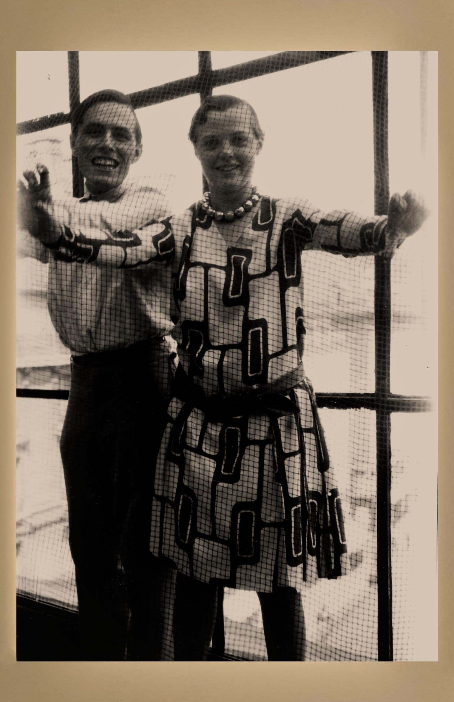
Charlotte Perriand with Alfred Roth in Place Saint-Sulpice apartment-studio, Paris, 1928
Courtesy: © ADAGP, Paris and DACS, London 2021 / © AChP / src it art bag
Charlotte Perriand with Alfred Roth in Place Saint-Sulpice apartment-studio, Paris, 1928
Courtesy: © ADAGP, Paris and DACS, London 2021 / © AChP / src it art bag
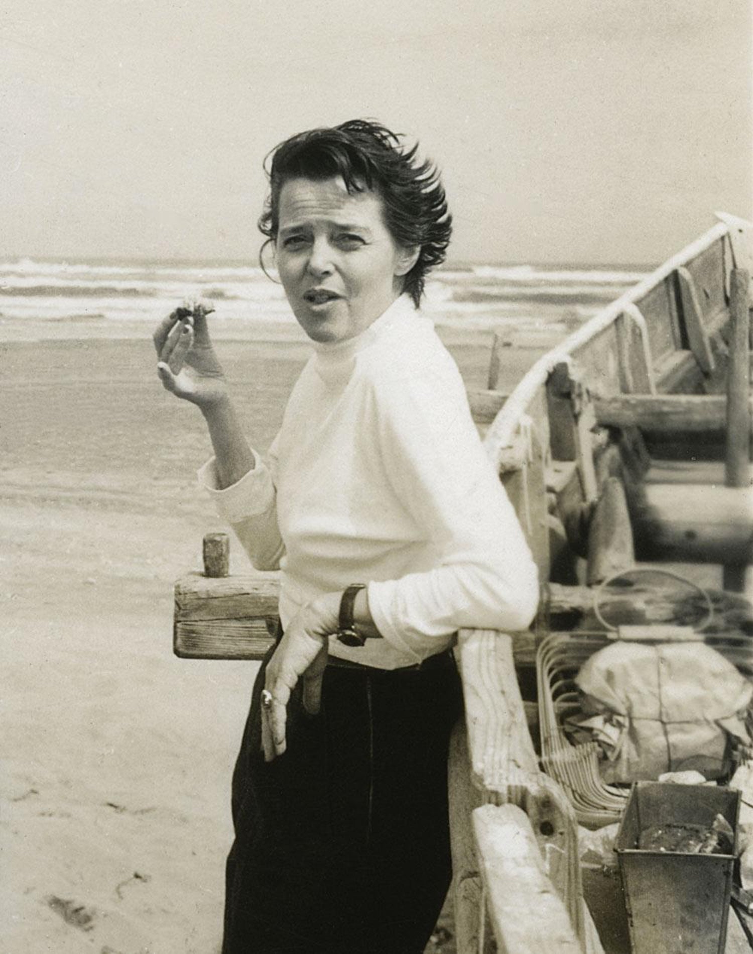
Charlotte Perriand, probably in Japan, ca. 1954 / 1st Dibs
Charlotte Perriand © AChP. Photo / ndion
Charlotte Perriand, Yogoslavie, 1934 | Flickr
Charlotte Perriand (1903-1999) in Japan, 1954. Photo: Jacques Martin / AChP © Archives Charlotte Perriand / src W magazine

Perriand’s Léger inspired necklace

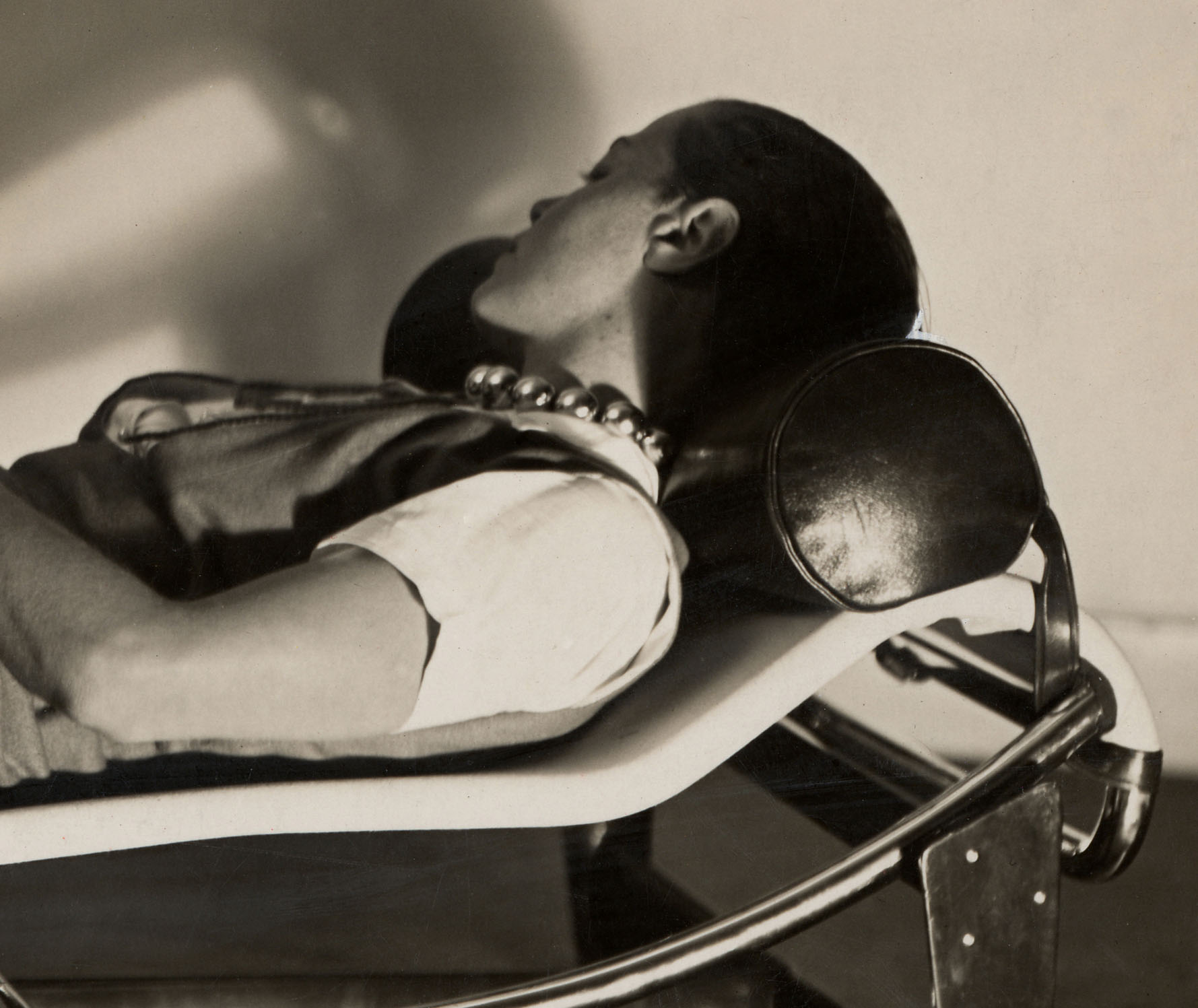
Detail of the image below. Note the silver choker, known as Collier roulement à billes chromées that Perriand wears.
Charlotte Perriand in the Chaise longue basculante, B306 (1928, Le Corbusier, P. Jeanneret, C. Perriand) Photo: Courtesy of Louis Vuitton Foundation, ph. by Pierre Jeanneret. | src Architectural Digest
Charlotte Perriand's ball-bearings necklace (Collier roulement à billes chromées - 1927)
Charlotte Perriand’s ball-bearings necklace (Collier roulement à billes chromées – 1927) | src Semantic Scholar
Charlotte Perriand (wearing her iconic choker) with Alfred Roth in Place Saint-Sulpice apartment-studio, Paris, 1928 
Courtesy: © ADAGP, Paris and DACS, London 2021 / © AChP / src it art bag
Charlotte Perriand (wearing her iconic choker) with Alfred Roth in Place Saint-Sulpice apartment-studio, Paris, 1928
Courtesy: © ADAGP, Paris and DACS, London 2021 / © AChP / src it art bag

Charlotte Perriand’s ball-bearings necklace was exhibited in 2009 at the exhibition “Bijoux Art Deco et Avant Garde” at the Musee Des Arts Decoratifs in Paris and, in 2011, in the show “Charlotte Perriand 1903-99: From Photography to Interior Design” at the Petit Palais. The necklace became, for a short period, synonymous with Perriand and with her championing of the machine aesthetic in the late 1920s and has subsequently attained the status of a mythical object and symbol of the machine age. This essay considers the necklace as an object and symbol in the context of modernist aesthetics. It also discusses its role in the formation of Perriand’s identity in the late 1920s, when she was working with Le Corbusier, and aspects of gender and politics in the context of the wider modern movement. [more on Semantic Scholar]

Fernand Léger :: Still life, Le Mouvement à billes (1926). Gouache and ink on paper. Signed with initials and dated 26.

 “I had a street urchin’s haircut and wore a necklace I made out of cheap chromed copper balls. I called it my ball-bearings necklace, a symbol of my adherence to the twentieth-century machine age. I was proud that my jewelry didn’t rival that of the Queen of England.”

Perriand had asked an artisan with a workshop in the Faubourg Saint-Antoine to make the piece out of lightweight chrome steel balls strung together on a cord. The piece was inspired by Fernand Léger’s still life “Le Mouvement à billes” (1926).

The necklace became a symbol of Perriand’s passion for the mechanical age […] (see also: Charlotte Perriand’s “Ball Bearings” Necklace on Irenebrination)

Fernand Léger :: Étude pour “Le Movement à billes”
Signed with initials F.L. and dated 26 (lower right). Gouache and ink on paper. | src Sotheby’s

“Art is in everything,” insisted Charlotte Perriand. […] When you see Charlotte’s chaise longue, chair, and tables in front of that immense Léger, you cannot imagine the design without the art—it is a global vision.

On an adjacent wall, Collier roulement à billes chromées (1927)—a silver choker made from automotive ball bearings that Perriand not only designed but wore—is placed next to a Léger painting, Nature morte (Le mouvement à billes) (Still life [Movement of ball bearings], 1926). [quoted from William Middleton review of the exhibition Charlotte Perriand: Inventing a New World, on Gagosian]

Friedensreich Hundertwasser

Friedensreich Hundertwasser :: Das vollständige druckgrafische Werk 1951-1986 (cover) | src Dobiaschofsky Auktionen
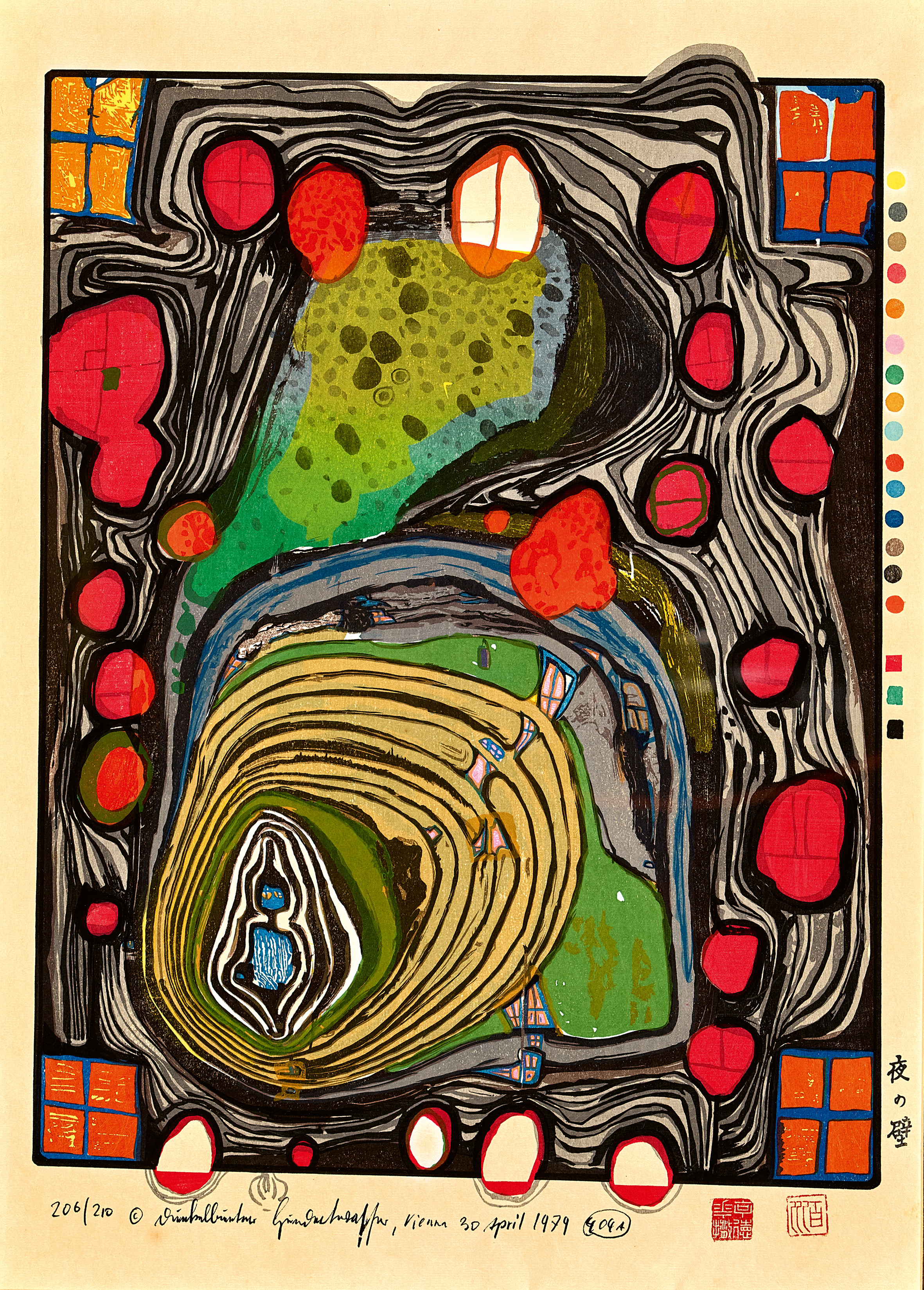
HUNDERTWASSER, FRIEDENSREICH Die Mauer, 1979
Friedensreich Hundertwasser :: Die Mauer, 1979 | src Dobiaschofsky Auktionen

Abeceda by Karel Teige (1926)

A page for Abeceda [The Alphabet], 1926
Poetry by Vitezslav Nezval (Czech, 1900–1958)
Design, typography, and photomontage by Karel Teige (Czech, 1900–1951)
Choreography by Milča Mayerová (Czech, 1901–1977)
src Listování. Moderní knižní kultura ze sbírek Muzea umění Olomouc | Západočeská galerie v Plzni
O page for Abeceda [The Alphabet], 1926

« In Nezval’s Abeceda, a cycle of rhymes based on the shapes of letters, I tried to create a ‹ typofoto › of a purely abstract and poetic nature, setting into graphic poetry what Nezval set into verbal poetry in his verse, both being poems evoking the magic signs of the alphabet. » –Karel Teige, quoted from Abeceda – Index Grafik

H page for Abeceda [The Alphabet], 1926

In 1926 the Czech dancer Milca Mayerová choreographed the alphabet as a photo-ballet. Each move in the dance is made to the visual counterpoint of Karel Teige’s typographic music. Teige was a constructivist and a surrealist, a poet, collagist, photographer, typographer and architectural theorist, and his 1926 photomontage designs for the alphabet are a uniquely elegant and witty invention, and one of the enduring masterpieces of Czech modernism. –Quoted from The Guardian

Shells and design, late 1970s

Karel Vaca :: Dívka s Mušlí (Girl with a shell), 1980. Vintage movie poster, offset print. Movie directed by Jiří Svoboda. | src Zezula
Karel Vaca (1919-1989) :: Dívka s Mušlí (Girl with a shell), 1980. Vintage movie poster, offset print. Movie directed by Jiří Svoboda. | src Zezula
Cymatium spengleri Perry. From "The shell: five hundred million years of inspired design" by Hugh Stix and Marguerite Stix, 1979. | src equator on IG
Cymatium spengleri Perry. From “The shell: five hundred million years of inspired design” by Hugh Stix and Marguerite Stix, 1979. | src equator on IG

Design for a frieze, 1910s

John Kauffmann :: Design for a frieze, aka Ti-trees, 1910-1920. Gelatin silver photograph, paper negative (and positive below), retouched with pencil. | src Art Gallery NSW

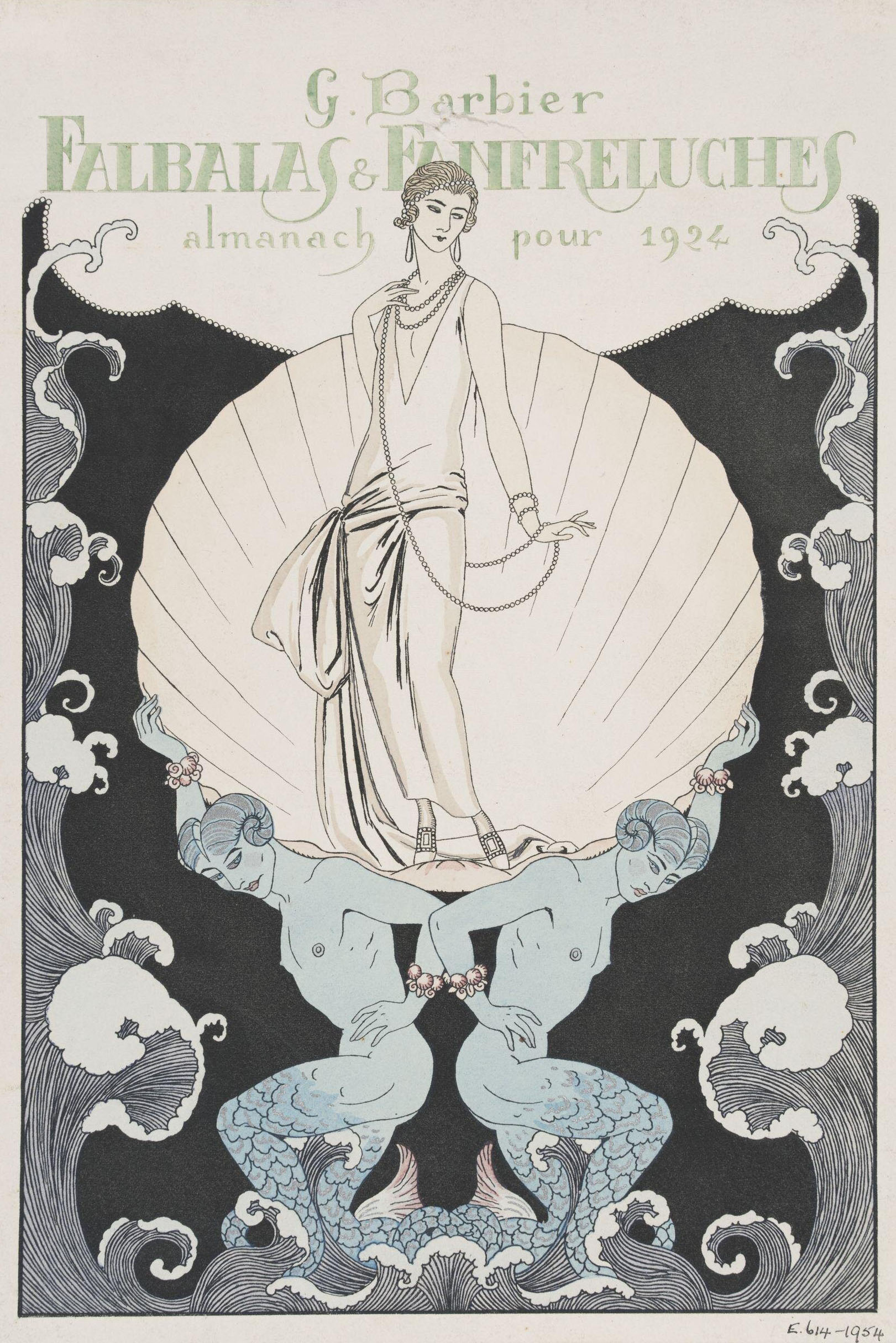
Falbalas et Fanfreluches, 1920s

‘Falbalas & Fanfreluches / 5 éme année / Almanach Des Modes Présentes, Passées & Futures Pour 1924 / Meynial éditeur Paris’ / src V&A Museum (Hand-coloured engraving) Title-plate (detail)
‘Falbalas & Fanfreluches / 5 éme année / Almanach Des Modes Présentes, Passées & Futures Pour 1924 / Meynial éditeur Paris’ / src V&A Museum (Hand-coloured engraving) Title-plate
George Barbier :: ‘Falbalas et Fanfreluches. Almanach des Modes présentes passées et futures pour 1923’. Titelblatt des Mode-Almanachs für das Jahr 1923. Meynial éditeur, Paris. | src MK&G
‘Falbalas & Fanfreluches / 5 éme année / Almanach Des Modes Présentes, Passées & Futures Pour 1926 / Meynial éditeur Paris’ / src V&A Museum (Hand-coloured engraving) Title-plate
‘Falbalas & Fanfreluches / 5 éme année / Almanach Des Modes Présentes, Passées & Futures Pour 1924 / Meynial éditeur Paris’ / src V&A Museum (Hand-coloured engraving) Title-plate
‘Falbalas & Fanfreluches / 5 éme année / Almanach Des Modes Présentes, Passées & Futures Pour 1926 / Meynial éditeur Paris’ / src V&A Museum (Hand-coloured engraving) Title-plate (detail)
‘Falbalas & Fanfreluches / 5 éme année / Almanach Des Modes Présentes, Passées & Futures Pour 1926 / Meynial éditeur Paris’ / src V&A Museum (Hand-coloured engraving) Title-plate